
ODYSI:
Mental Health, Demystified
OVERVIEW: The COVID-19 pandemic has brought on higher levels of anxiety, depression, and substance abuse, disproportionally affecting minority groups and the uninsured.
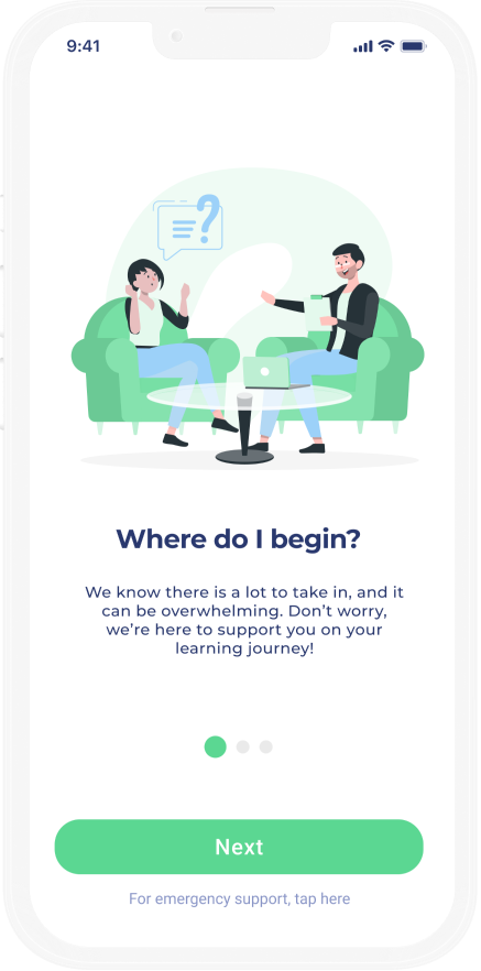
ODYSI is an interactive tool that demystifies the process of seeking mental health care by breaking down the process step by step, regardless of insurance status.
MY ROLE: UX Design, Interviews, Prototyping & Testing
TOOLS & METHODS: Figma, Illustrator, Procreate, User Interviews, Usability Testing, Storyboarding
TEAM: Vanessa Chien Lai, Kara Bates, Katrina Ma, Ji Su Park
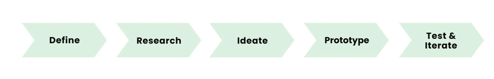
Our Design Process
Defining Our Design Question:
How might we demystify the process of seeking mental health support?
User Research
For our research we conducted 13 interviews, 2 surveys, and analyzed 8 competitor tools. Our main goals were to identify main pain points of therapists and patients, understand the challenges of current mental health tools, and uncover feelings of those seeking mental health care.
-
Our first step in research involved two surveys: one for patients and one for therapists. The responses we received helped shape our interview questions for later stages.
-
We conducted in-depth one-on-one interviews with 5 patients and 8 therapists of different background and specialties. The interviews helped us take a deeper dive into some of the insights from the survey.
-
We chose 8 online tools for mental health professionals: Advekit, BetterHelp, Monarch by Simple Practice, Psychology Today, Quartet, Regence, TherapyDen and Zocdoc—popular platforms with a variety of features.
Key Insights
01
Most individuals seeking help for the first time feel stressed, overwhelmed, and intimidated.
02
Although therapists have no trouble finding patients, many BIPOC therapists have difficulty finding clients from their own communities due to stigma.
03
The main pain point for patients isn’t a lack of tools, but rather a lack of understanding and friendly guidance.
Personas & Storyboards
After gathering our research findings we developed three personas to help us better orient our design goals and keep these users in mind. While we understand that three personas cannot fully capture the intersectional identities of potential users, it helped us gain empathy and varied perspectives when making design decisions.
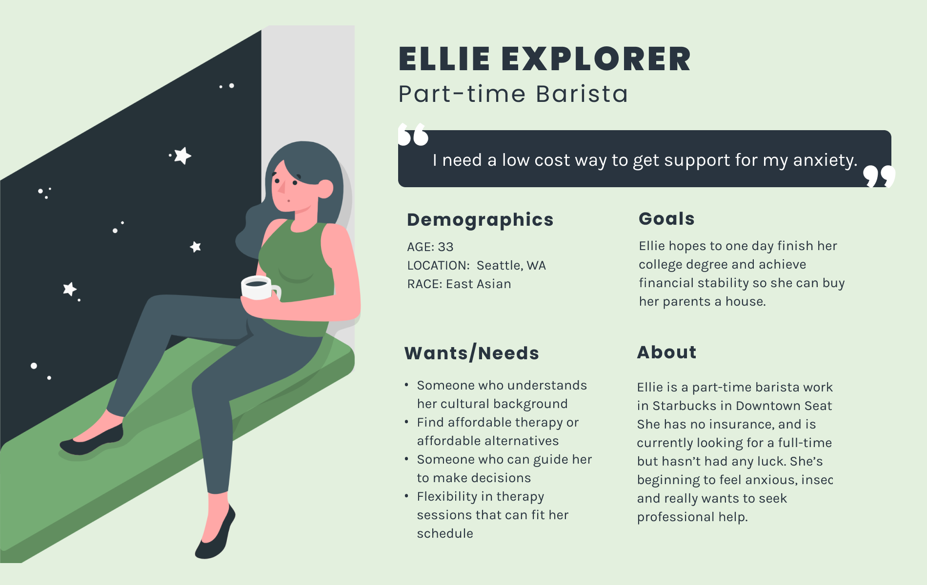
Primary Persona
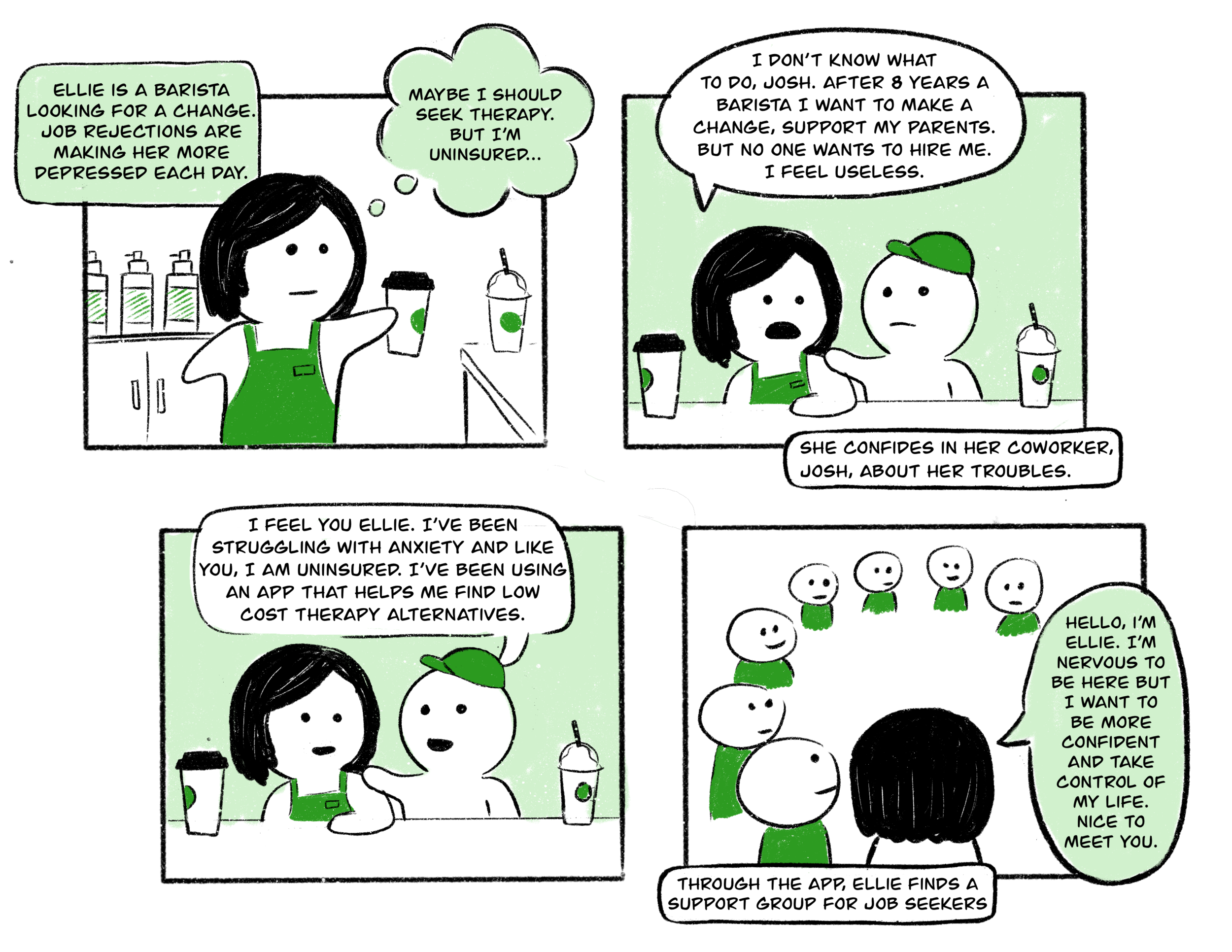
Storyboard
Ideation & Sketching
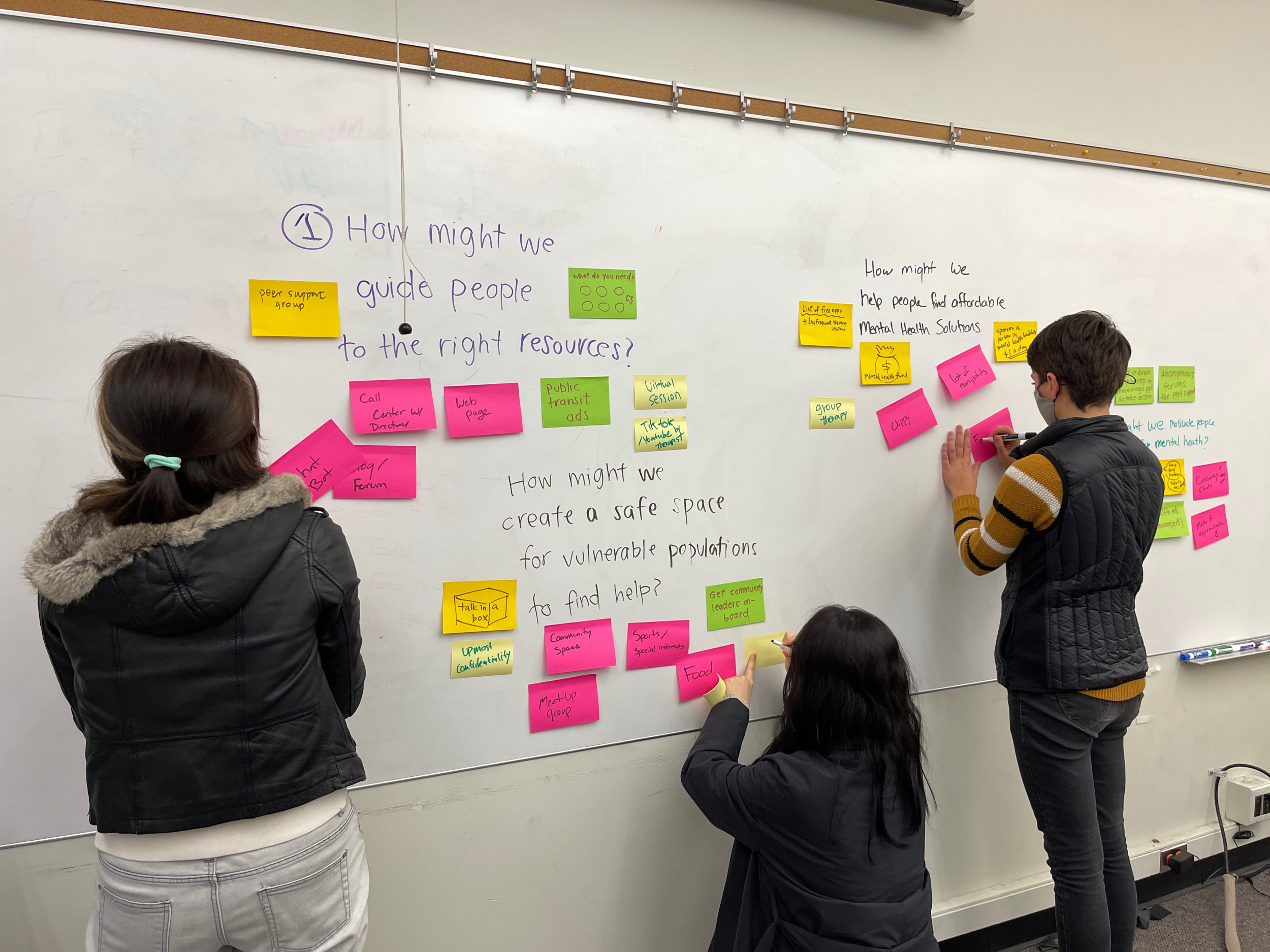
Ideation
We brainstormed and sketched 24 distinct ideas in directions of combating stigma, finding affordable care, and guiding people to mental health resources. We narrowed down to one idea: a “Trip Planner,” using trip planning as a metaphor for a user’s mental health journey. Like most journeys, mental health is not a linear process.
Information Architecture
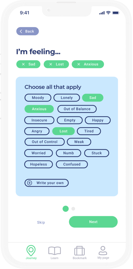
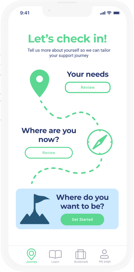
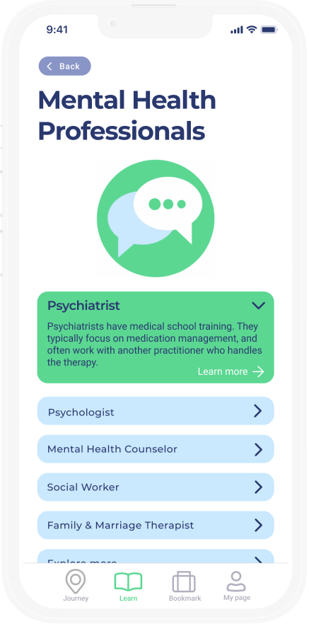
“Trip planner” is a tool that helps users plan their mental health journey - To help them set their destination, figure out who can guide them there, understand what they’ll do in the journey, how long it will take and how much it will cost. We developed the information architecture which focused on 3 key flows.
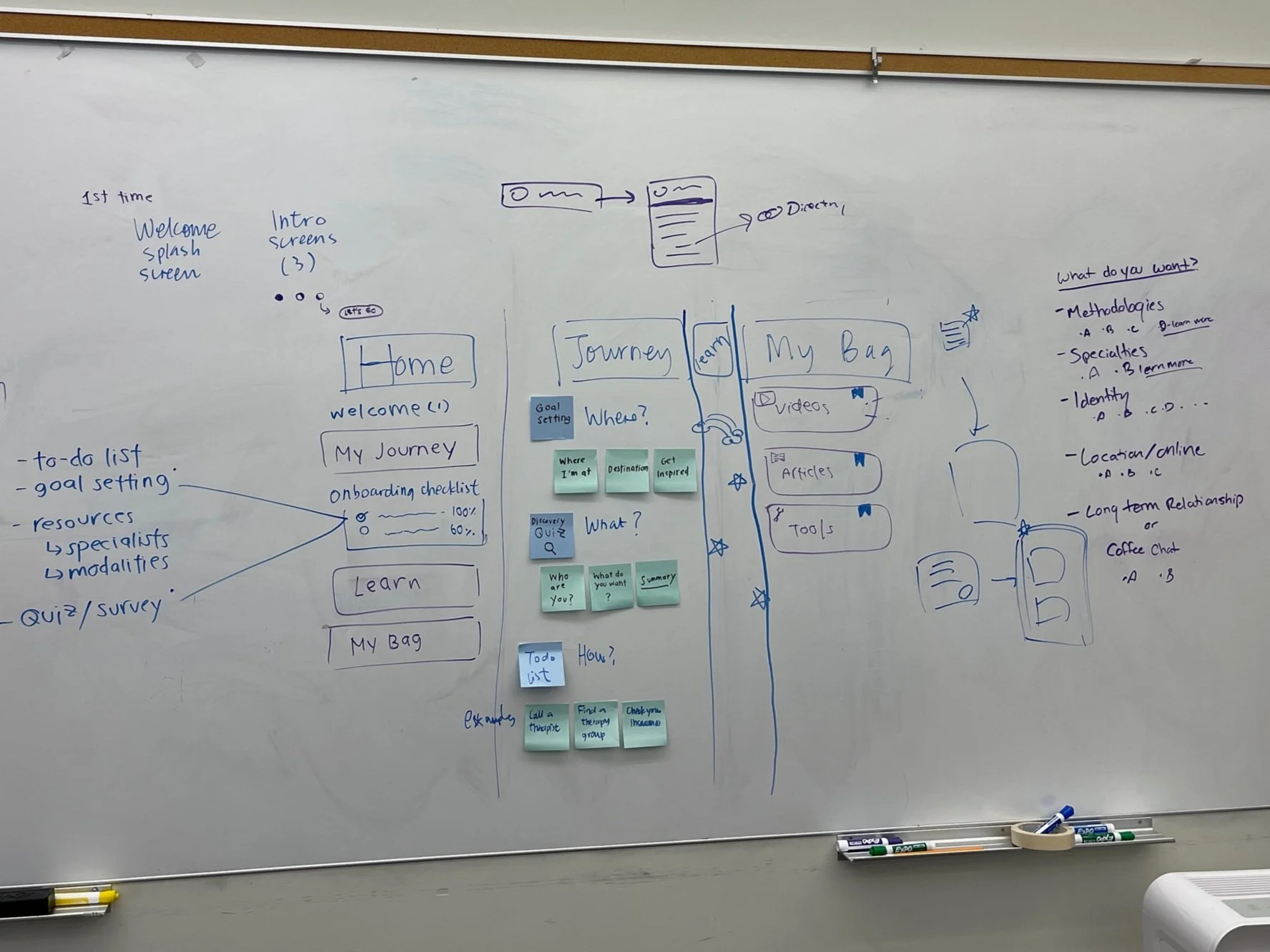
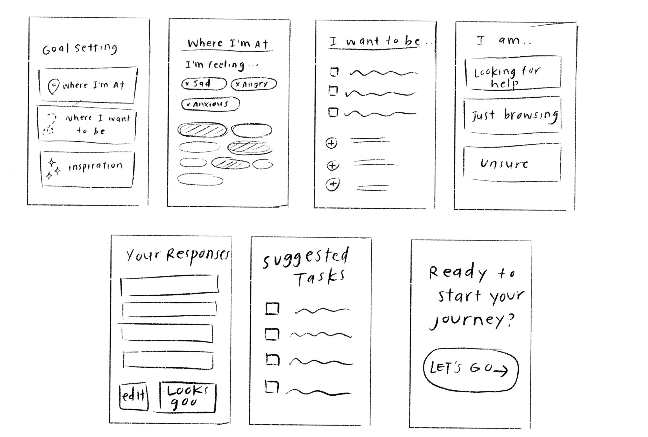
Initial Sketches
Usability Testing
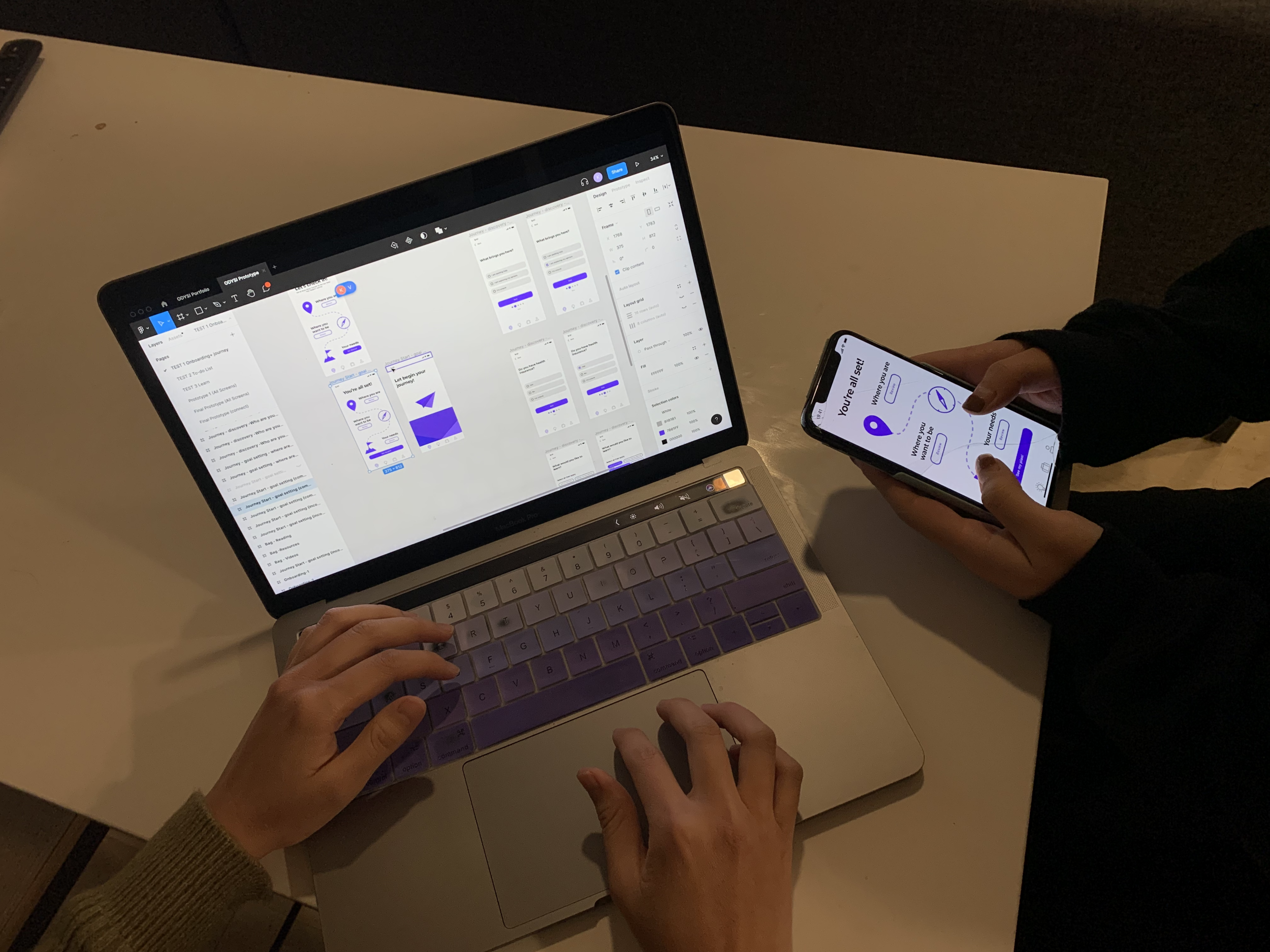
We presented the click-through prototype to the 8 users and asked them to complete a task using each flow. We used the “think aloud” method to gauge participants’ immediate thoughts and asked follow-up questions.
The results were less than ideal. The users mentioned our metaphor of a journey was intimidating, our interface was confusing, and the task list wasn’t as functional as they had hoped. In our final iteration of the app we applied the following to solve these issues.
Targeted Tasks
Make tasks more specific, actionable, and targeted to provide clear, concise steps for the user to follow.
Make it fun
Add a gamification aspect to the app that both improves enjoyment can clarify user flow. Win win!
Simplify Interface
Simplify the interface to make the experience more intuitive. Our users were confused by the flow and information architecture of the app.
Expand Metaphor
Expand our “journey” metaphor to communicate that mental health is a journey, so you need a plan.
Iterating Towards a New Direction
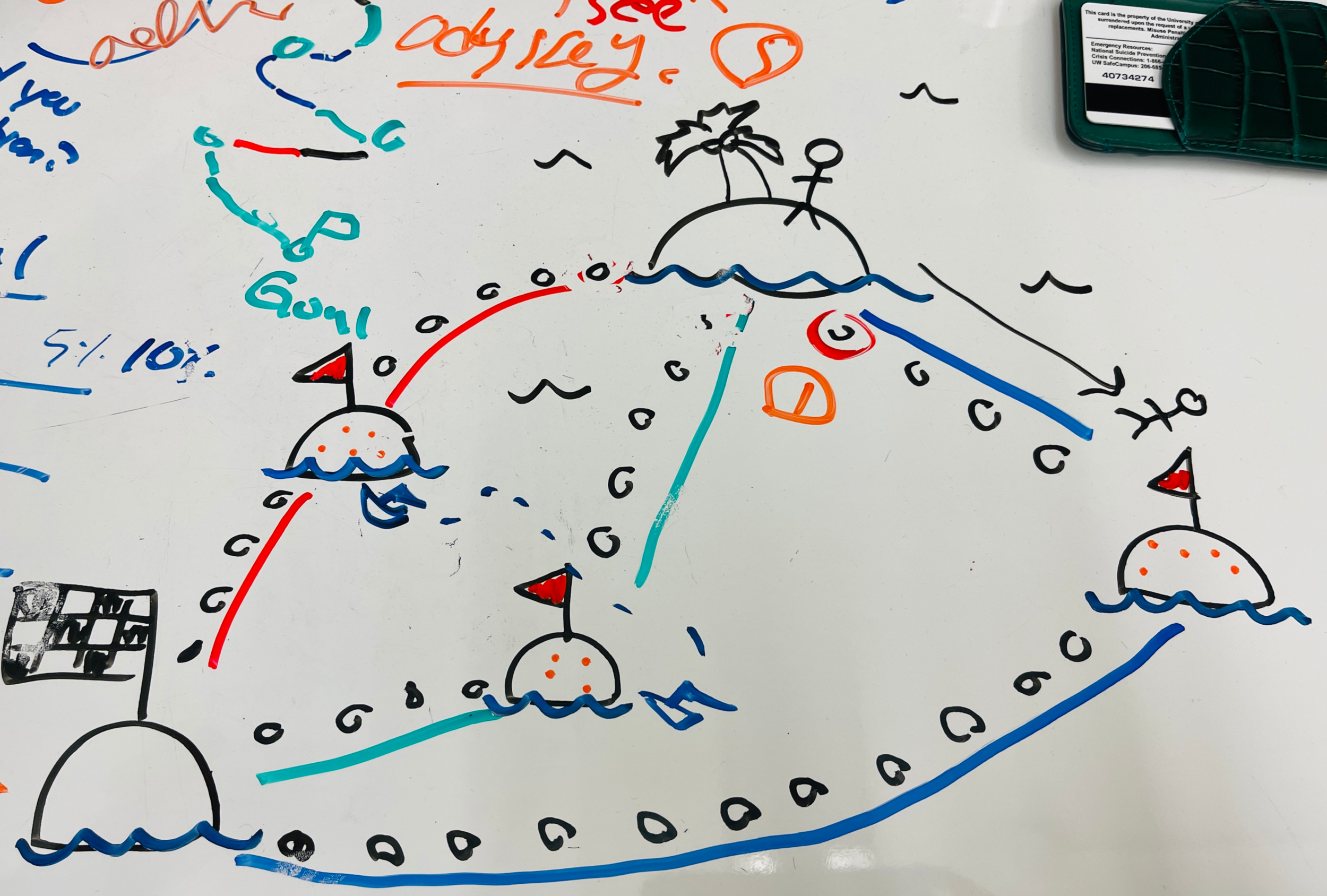
Brainstorming session sketch
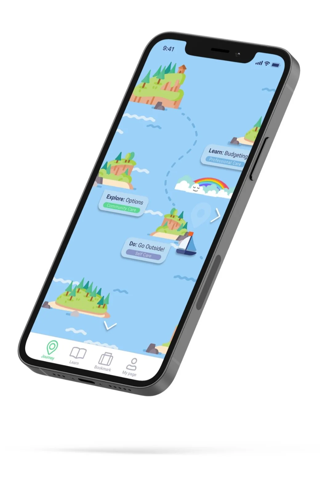
Island Hopping Concept
We learned from users that they found the task list most valuable, so we decided to focus on improving this feature. We went back to the drawing board, and during an intense brainstorming session, we came up with the idea of turning our task list feature into a game.
The creative vision for our new idea was an island hopping game, reminiscent of several adventure-based video games from our childhood.
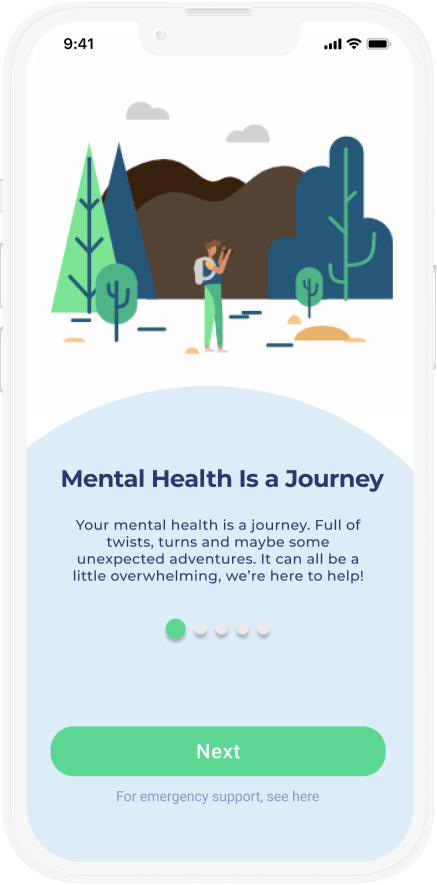
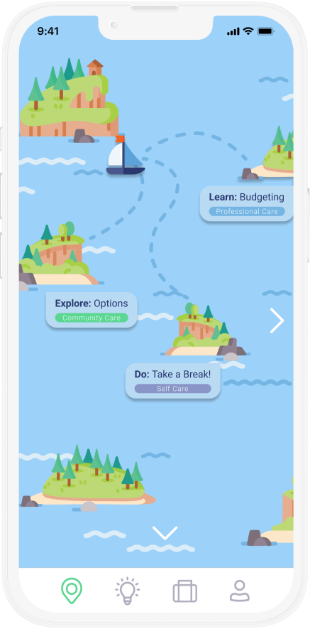
Final Prototype
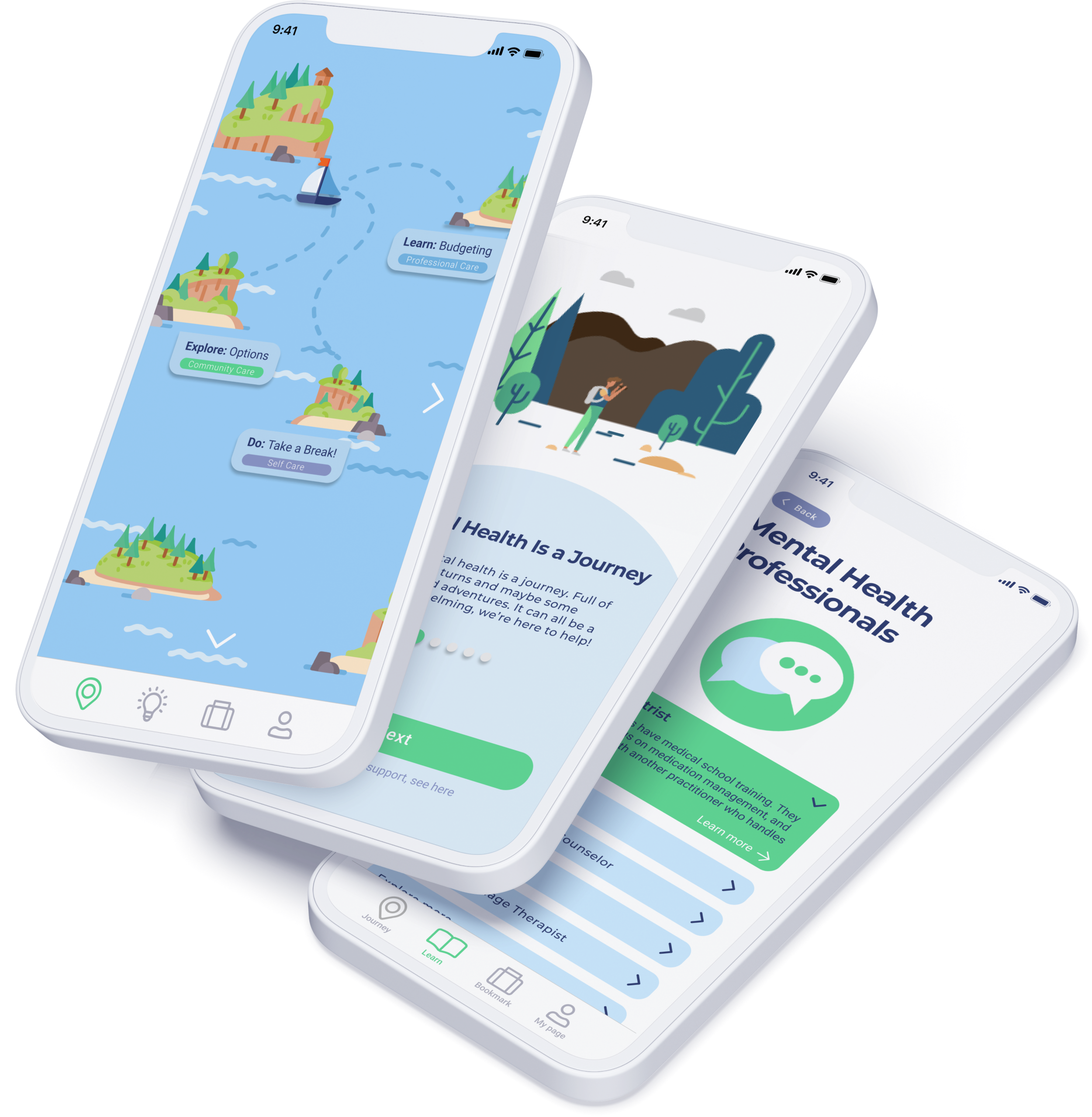
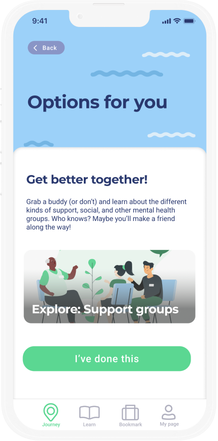
How does it work? Each task is represented by an island the user can travel to. Every time a user completes a task, it unlocks more islands they can travel to. This taught us an important lesson: like island hopping, the mental health journey is not linear.
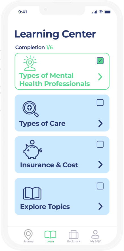
In addition, we decreased the prominence of our learn center, eliminated our old “home screen” and added more questions to the onboarding screen to customize the experience.
Reflection
Mental healthcare (and healthcare, for that matter) has multi-dimensional problems that require multi-dimensional systemic solutions. This project taught me more than I could imagine about the struggles of seeking mental health support, and solidified my commitment to give voice to vulnerable communities through participatory design.
ODYSI only addresses one of the many challenges associated with seeking help: stigma (and lack of education as a result). The problem can be tackled from various other angles—healthcare reform, funding for community centers and social workers, and more. There are many changes I'd love to have made given more time and I hope to continue pursuing projects in the mental health space!
Future Considerations

Expand the game model by providing accomplishment badges and personalized challenges.

Expand our questionnaire to increase personalization and enhance recommendations for our users.
Conduct additional rounds of testing to measure emotional impact of the gamification model (perhaps a diary study).