
Optimism Brewing
UX DESIGN / USABILITY STUDY
ROLE
UX/UI Designer
Web Designer
TIMELINE
Mar 2022 — Jun 2022
TEAM
Tabby Safari - UX Designer
Rodrigo Tarriba - Usability Specialist
Jessica Hord - Project Manager
Joyce Chang - UX Researcher
Vanessa Chien Lai - UX/UI Designer
My Contributions
Interviewed brewery stakeholders to align business goals with UX strategy
Collaborated on usability testing to inform and refine information architecture
Partnered with UX research to synthesize findings and shape actionable recommendations
Turned findings into design prototypes and worked with teammates to gather feedback and iterate
Owned end-to-end development by implementing design recommendations in Squarespace with custom CSS
SKILLS
Product Design
Usability Research
UX Research
Taxonomy Design
Web Design
PROJECT OVERVIEW
Refresh and redesign the website of Optimism Brewing to improve usability, increase e-commerce traffic, and reinforce company mission and values.
Skip to final design overview →
THE PROBLEM:
In the highly-saturated Seattle craft beer market, Optimism Brewing is struggling with its digital brand presence and underperforming revenue streams.
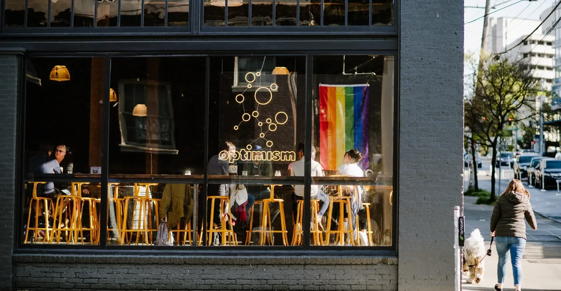
About Optimism Brewing
Optimism Brewing Company is a family-run brewery celebrated for its wide-ranging craft beer lineup and spacious, industrial-style space. Nestled among Seattle's growing brewery ecosystem, Optimism sought a website overhaul to differentiate themselves from the competition.

Unclear brand mission
True to its name, Optimism was built on the belief that a brewery can be a force for good — donating to local charities, hosting fundraisers, and championing progressive practices like a no-tip policy. Despite this mission-driven identity, their website told little of that story. Details about their purpose were largely absent, leaving visitors without a clear sense of the brand's values.
Usability & accessibility concerns
Various usability concerns made the website difficult to navigate, including color contrast issues, broken links, complex information architecture, and cluttered pages with wordy copy. This created a user an overwhelming user experience of information overload with no clear message.
Result: struggling revenue streams
As a result of the above concerns, the website failed to drive traffic to its canned beers, event bookings, and merch sales—leaving significant revenue opportunities on the table. Without these touchpoints guiding visitors toward a conversion point, Optimism was regularly missing its monthly e-commerce goals.
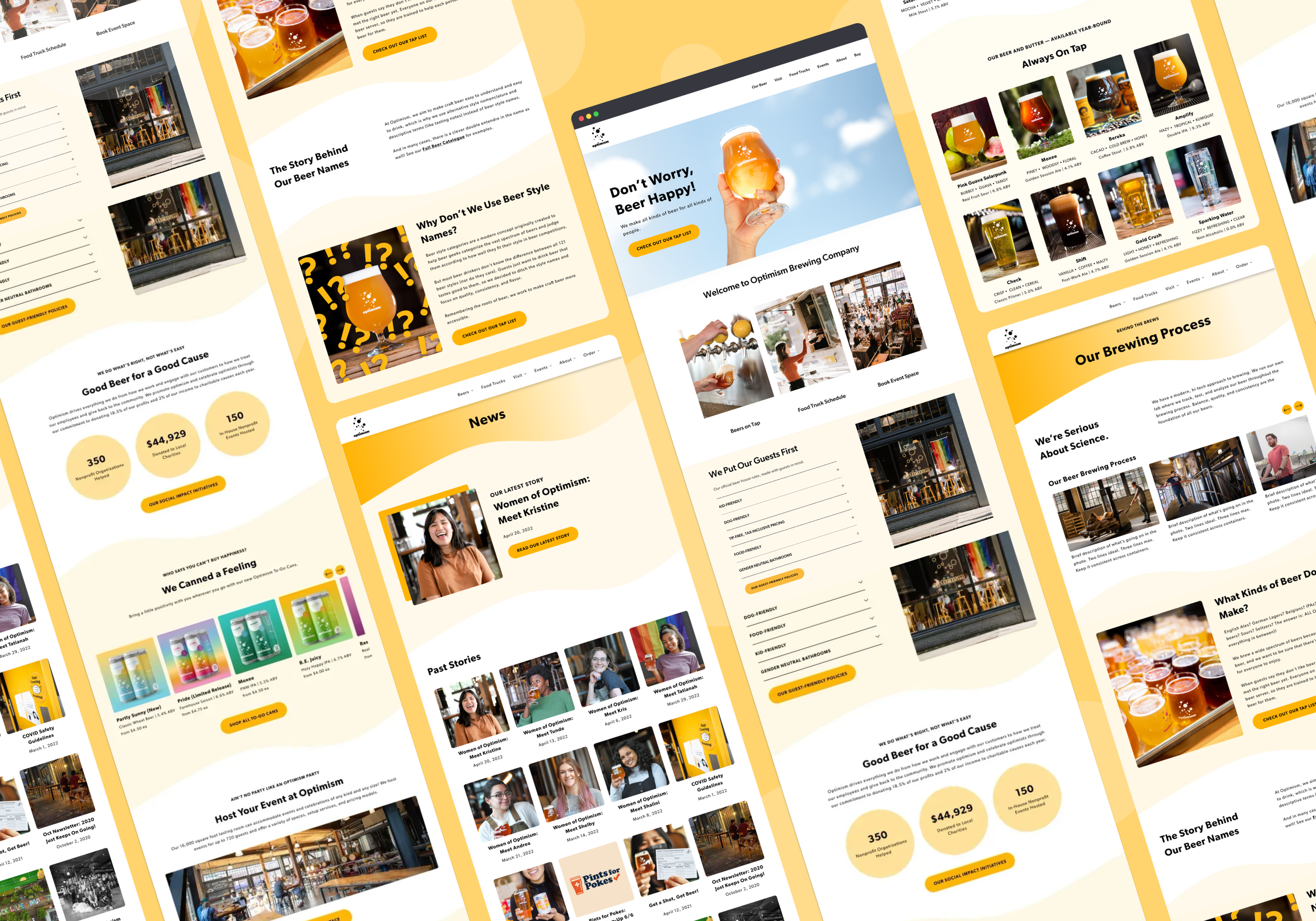
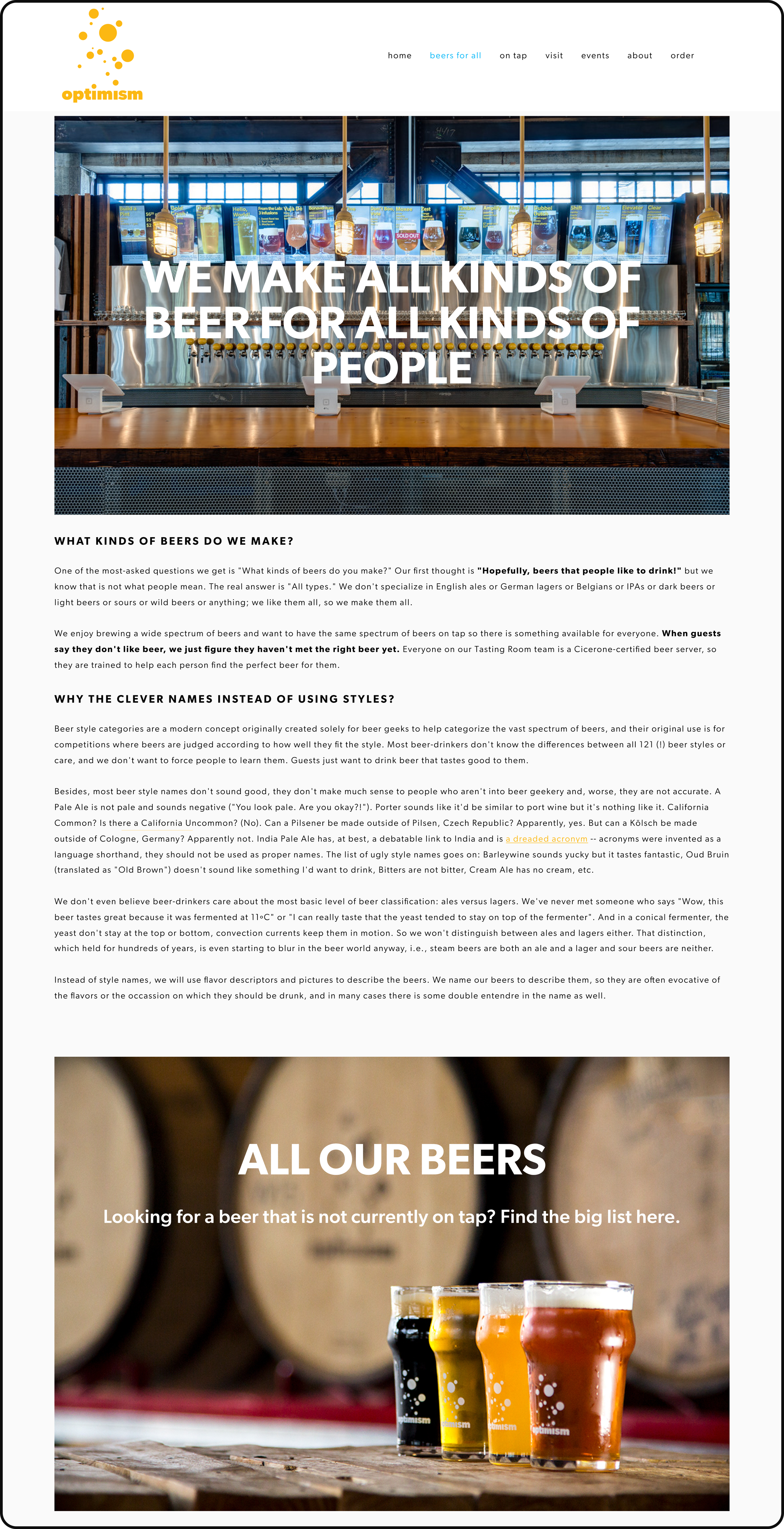
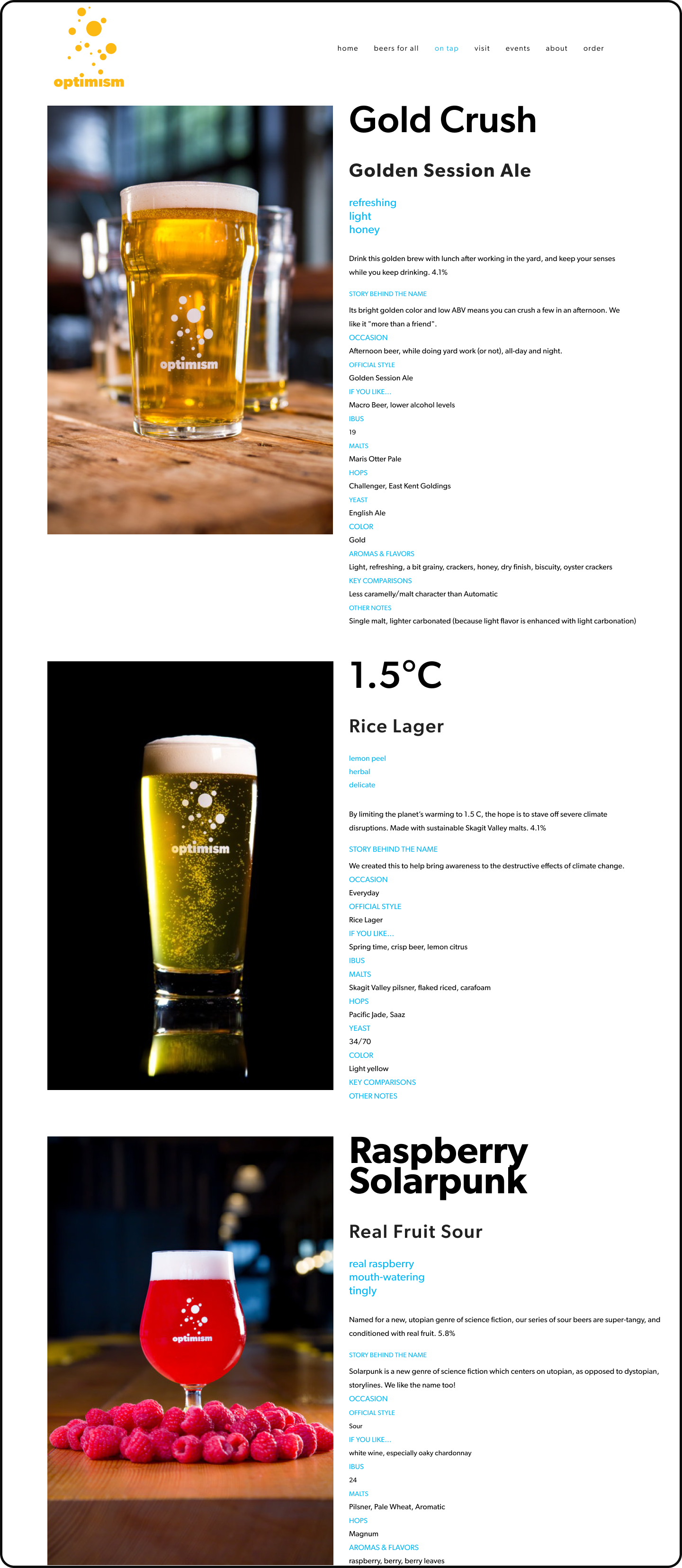
Old website designs
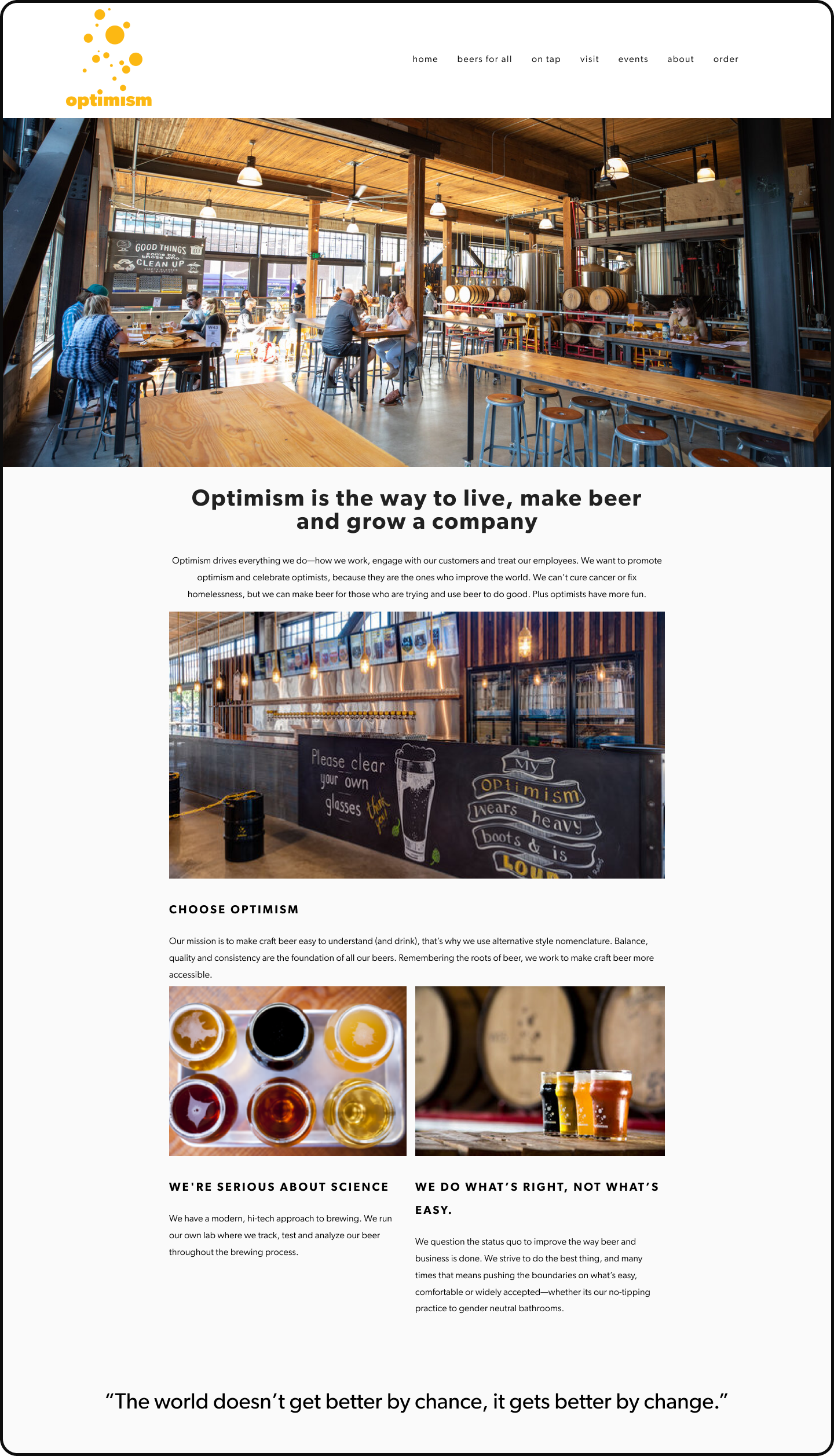
Old - home page
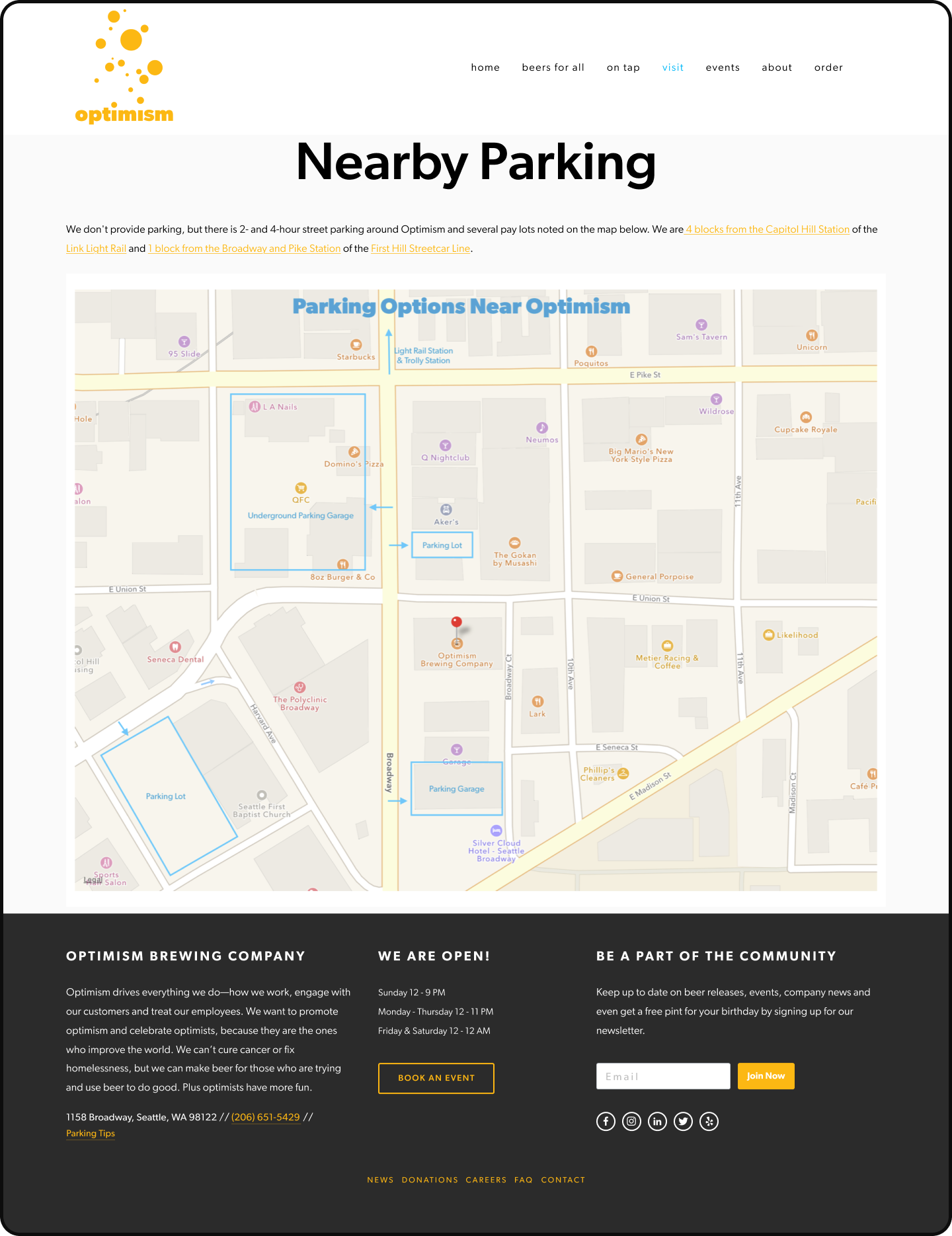
Old - parking info
Old - beers for all
Old - tap list
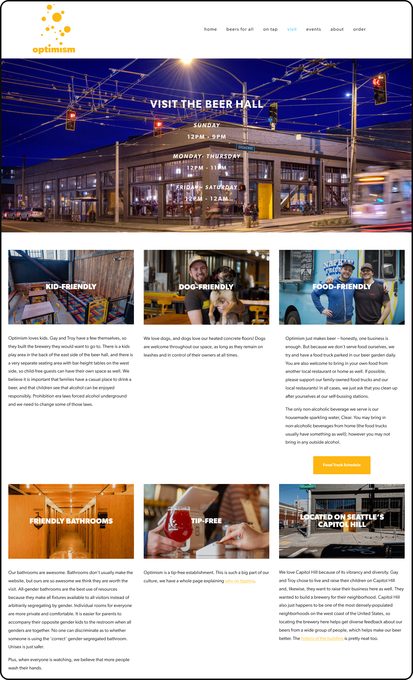
Old - beer hall
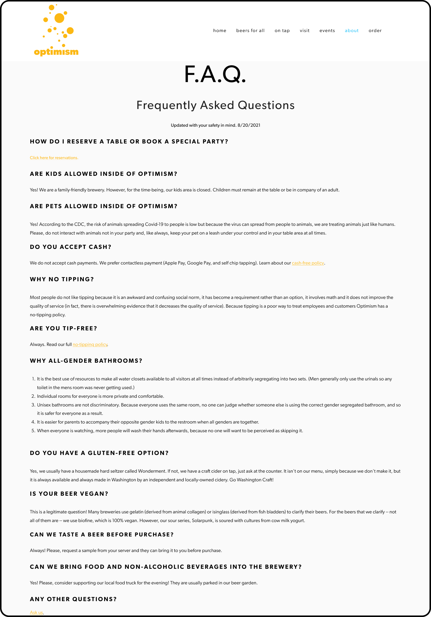
Old - FAQ
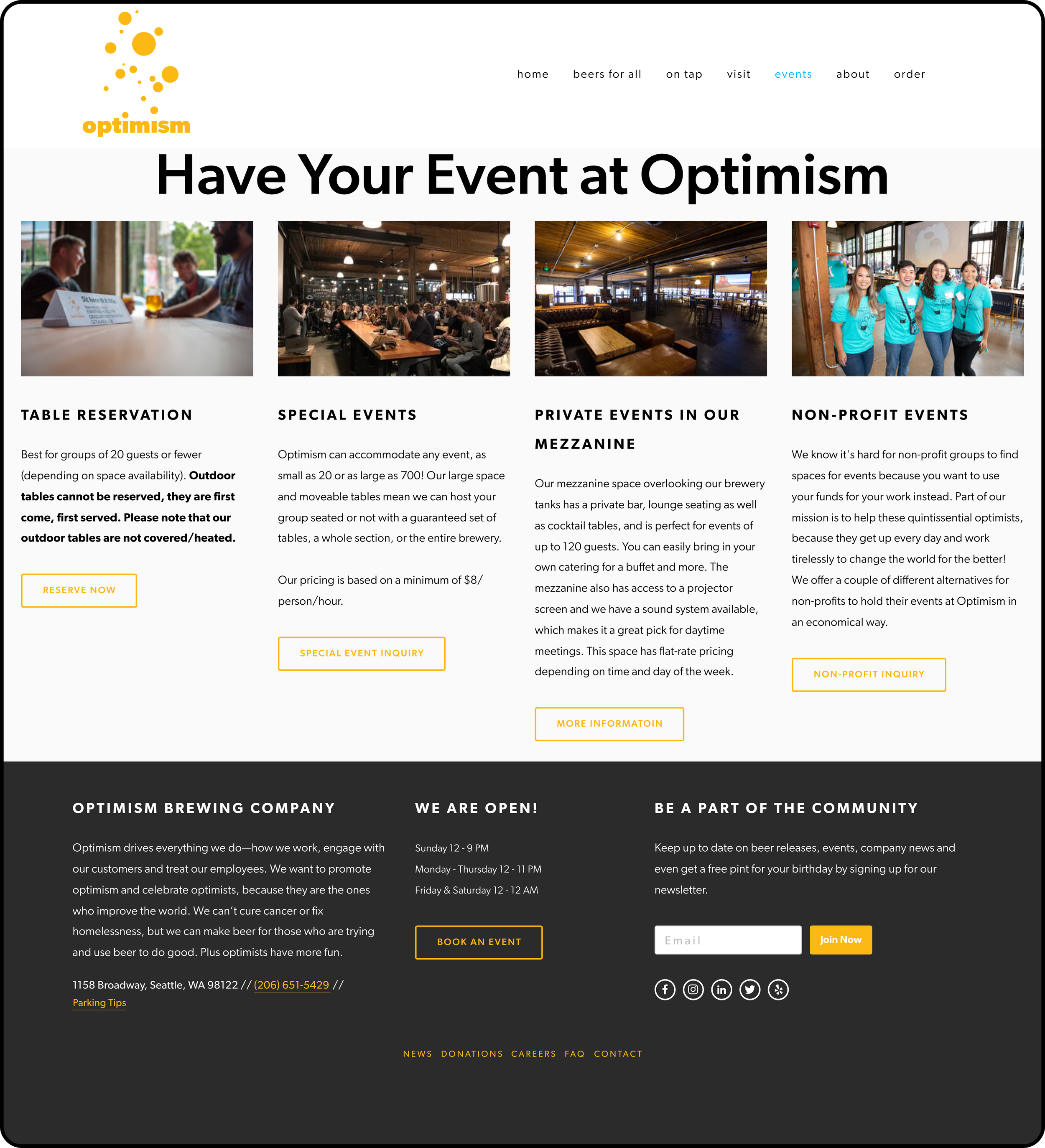
Old - events
OUR DESIGN PROCESS
1. Discover
Diverge: learn everything about the problem via qualitative and quantitative research. Understand underlying issues and root causes.
2. Define
Converge: synthesize what you learned in the discovery phase and begin crafting insights and requirements.
Jump to Define →
3. Develop
Diverge: brainstorm and explore ideas, develop and test explorations with users. Make mistakes!
Jump to Develop →
4. Deliver
Converge: hone in on the things that worked, harness learnings to refine and deliver the solution for the client
Jump to Deliver →
DISCOVER:
Conducting research to discover through user interviews, surveys, usability testing, competitive analysis
Customer Survey & Interviews
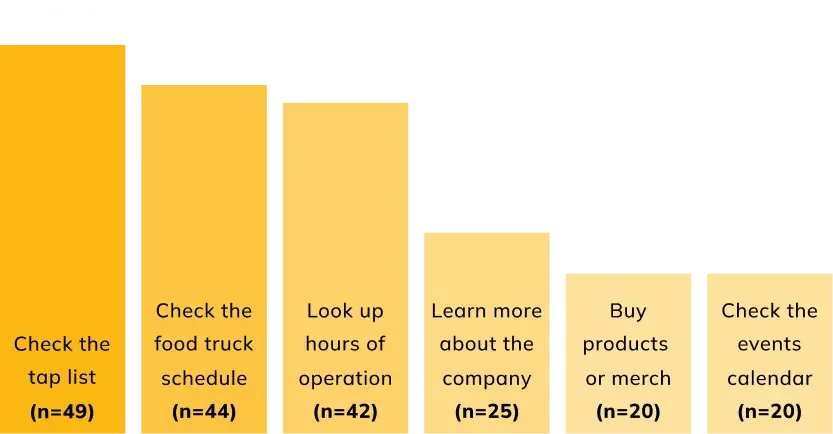
With the Optimism team, we designers and delivered a Customer Experience and Demographic survey to understand Optimism’s current crowd (users).
85 respondents ranked their most common user tasks when visiting the brewery’s website.
In addition to the survey, we made a trip on site to interview customers in the wild. We asked about their motivations, brand perception, and overall website experience. Interviewees noted:
Atmosphere: one of the most appealing qualities about the brewery was its size and atmosphere—a wide open, dog friendly space with plenty of seating
Social settings: 2 of 4 interviewees mentioned visiting the brewery as a social function, meeting with friends and coworkers after work.
Food truck selection: participants mentioned their decision to visit was heavily impacted by what food trucks would be available on any given day.
Social impact: while 3 of 4 interviewees knew about the social responsibility mission of Optimism, they weren’t aware of specifics.
Usability testing
We conducted usability tests with 5 Optimism customers who had never been on the website. To assess usability, we had users complete a set of tasks and scored them by level of difficulty.

Explore the tap list
We conducted usability tests with 5 Optimism customers who had never been on the website. To assess usability, we had users complete a set of tasks and scored them by level of difficulty.

Buy a gift card
We conducted usability tests with 5 Optimism customers who had never been on the website. To assess usability, we had users complete a set of tasks and scored them by level of difficulty.

Browse food trucks
We conducted usability tests with 5 Optimism customers who had never been on the website. To assess usability, we had users complete a set of tasks and scored them by level of difficulty.

Book an event
We conducted usability tests with 5 Optimism customers who had never been on the website. To assess usability, we had users complete a set of tasks and scored them by level of difficulty.
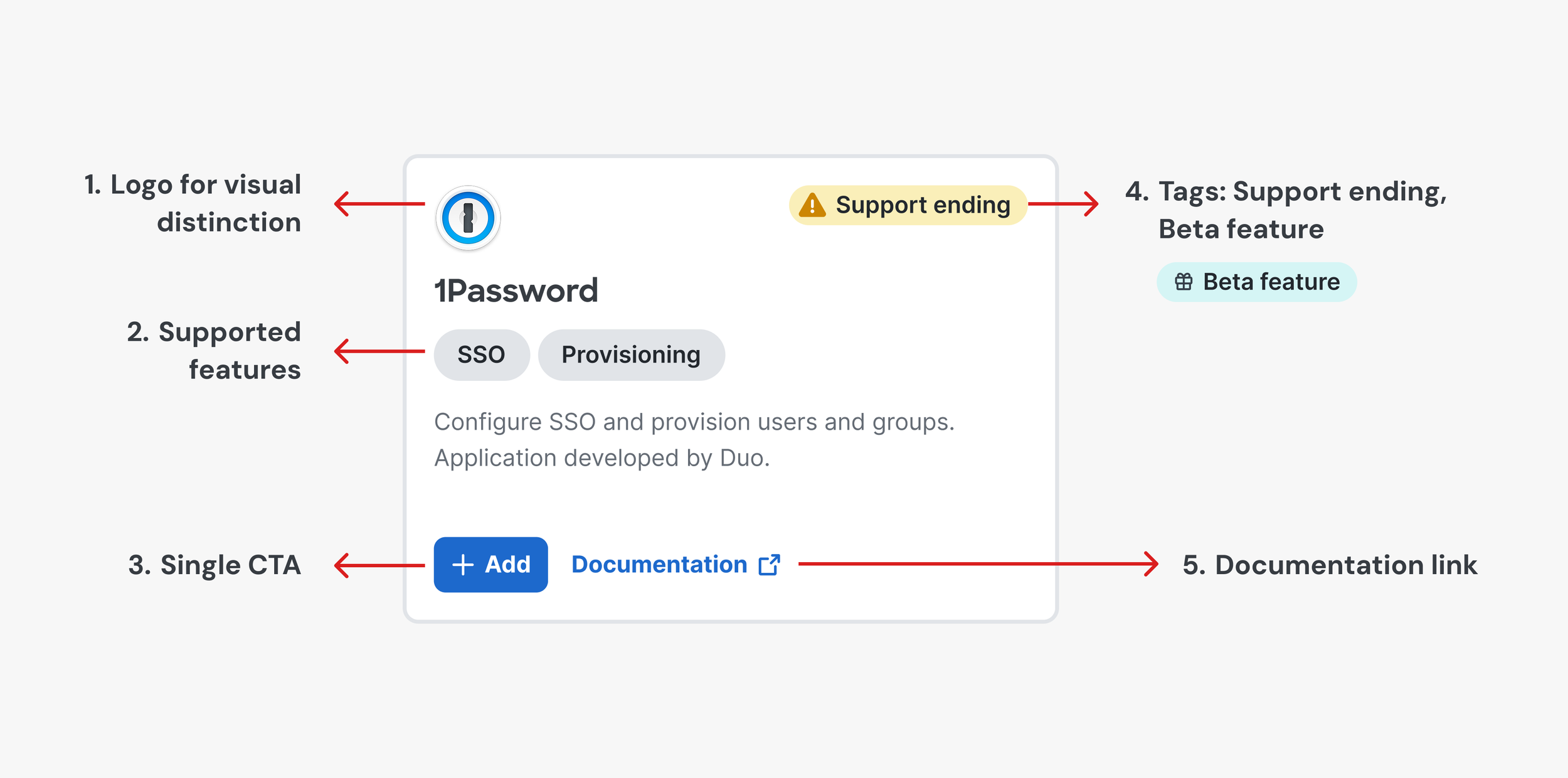
SOLUTION PART 1: THE APPLICATION CATALOG
Introducing the Duo Application Catalog: a new way to browse for apps, services, and integrations you can protect with Duo's authentication platform.
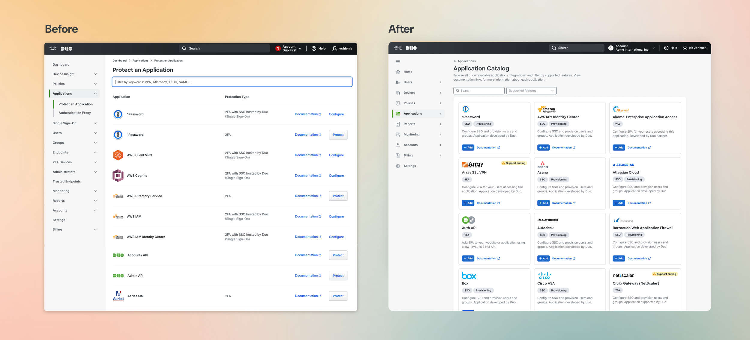
DESIGN ELEMENT #1
📖 Scannable catalog, not endless table
One of the major pain points our end user faced was a cumbersome, clunky search experience. I wanted to create an experience that would be similar to browsing a magazine catalog—a UX pattern that exists in online marketplaces, property listings, and more. The concept of cards was a reliable framework I believed would serve a great foundation for this experience.
DESIGN ELEMENT #3
💻 Smart + templatized = scalable design
I sought to balance uniformity with scalability. While each card element was carefully calibrated to fit precisely within its container, the design leaves room for variation in text descriptions, logo dimensions, and possible tags. The result? An effortless look that grows with the product.
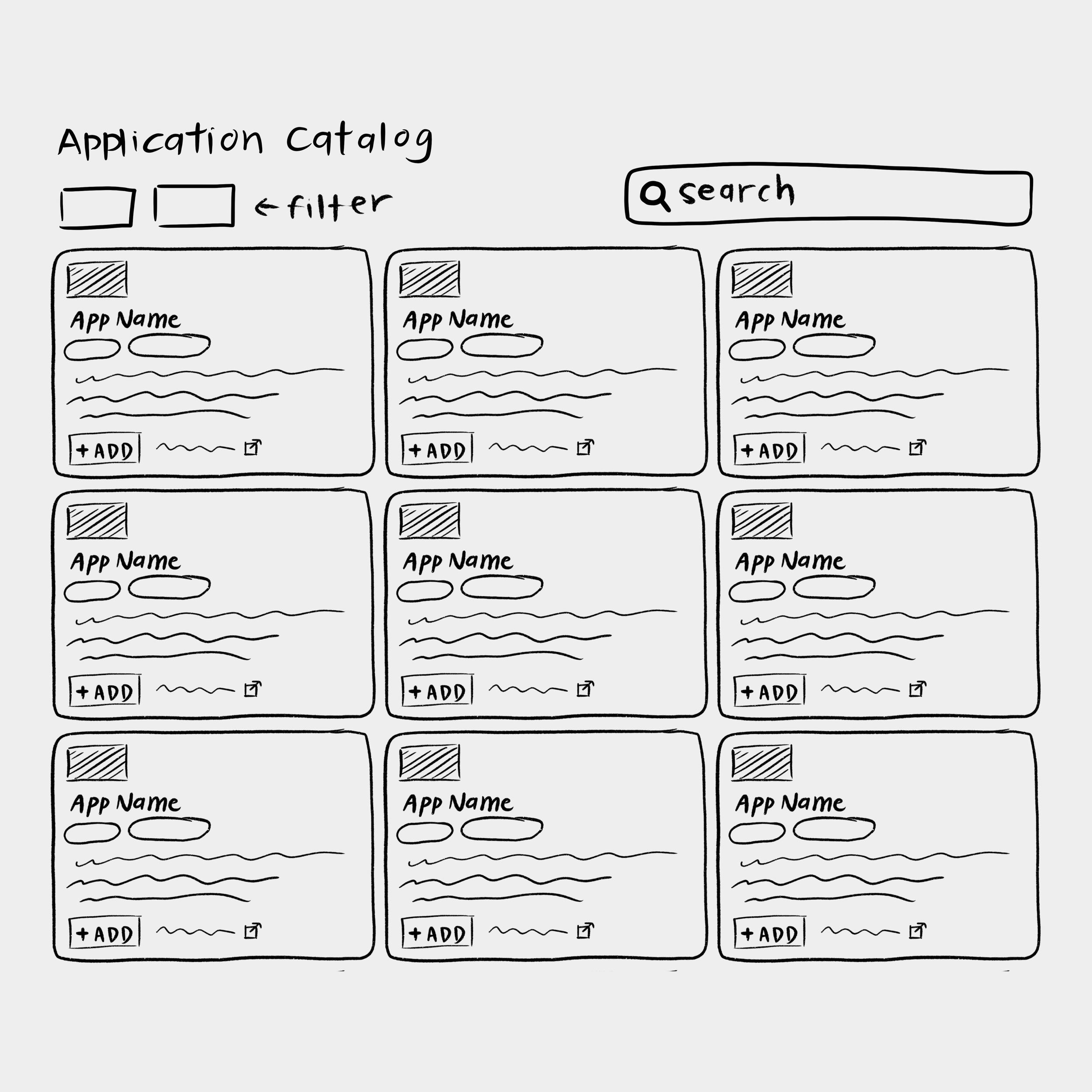
DESIGN ELEMENT #2
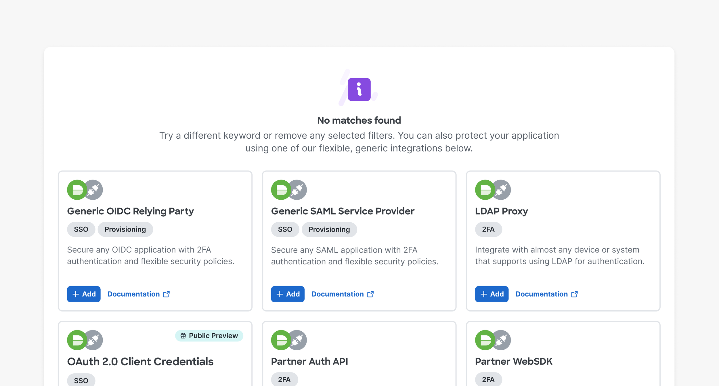
🧭 Gentle guidance via filters and friendly guardrails
While filters help the user find what they’re looking for, the experience is designed to support even those who don’t. Duo offers generic integrations that can be used to configure any application. When we can’t find a match for the user’s query, we suggest these instead.
SOLUTION PART 2: THE APPLICATION LIST
Once added, the applications are housed in a new and improved Applications page—the source of truth for application information.
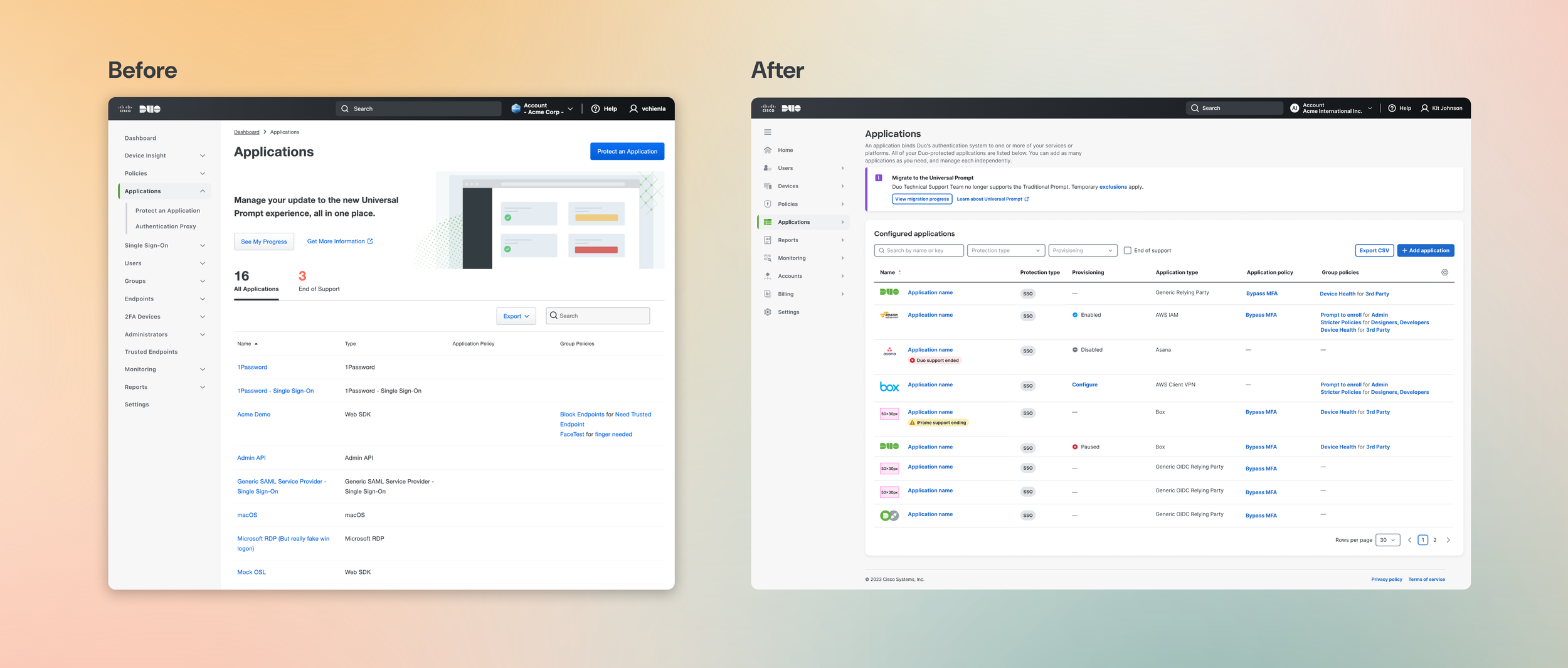
DESIGN ELEMENT #1
🔎 Information density balanced with better search
We learned through research that often, users wanted more information at a glance. Hiding information behind clicks was frustrating, especially for tech savvy users. We designed to create an information-rich UI without compromising on navigability. Improvments included:
New filters to filter by protection type, as well as SCIM provisioning functionality
Checkbox to reveal newly- or soon-to-be deprecated applications
Sortability for each column
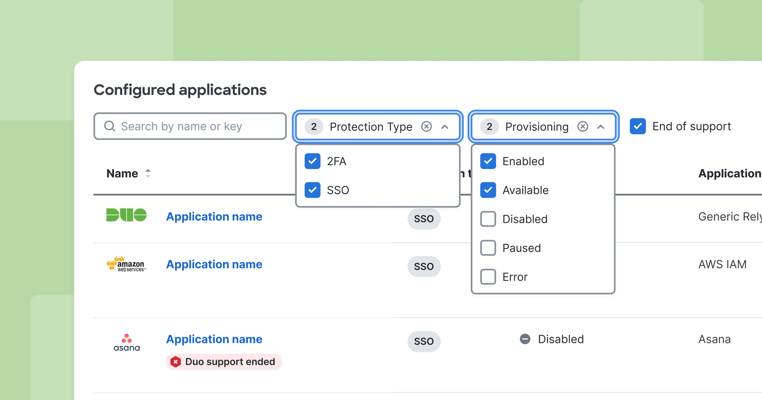
DESIGN ELEMENT #2
📊 Provide flexibility for all with column customization
While we aimed to provide as much information as possible, we created a nice-to-have feature that allowed the page to adjust to user needs: the column customizer. Users can select which columns they want to show or hide, and their preferences are saved and remembered.
IMPACT
We created a smoother, data-rich, navigable experience that helps IT admins search, select, and configure applications.
Faster application search
When users look for their applications, filtering, better fuzzy search, and generic integrations get them to where they’re going.
No more dead ends
Users who could not find their applications were routed to generic, universal integrations that would still work with their application needs
Crucial information at a glance
With a flexible, data-rich application list, users no longer have to visit multiple pages to see provisioning status and policies applied to their applications